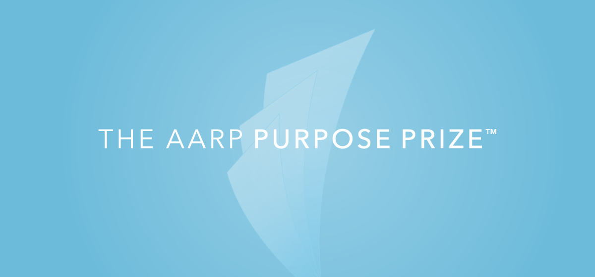
The AARP Purpose Prize is an award that celebrates people aged 50 and older who are using their life experience to make a difference. The Purpose Prize transitioned to AARP in 2016, requiring us to create a new visual identity to be used over the next five years. For the audience, we targeted age 50-plus social entrepreneurs and philanthropic leaders who believe making a difference is ageless.
The goal we established in branding The AARP Purpose Prize was to elevate the prize winners and honor their work. In doing so, we would increase AARP’s relevance.
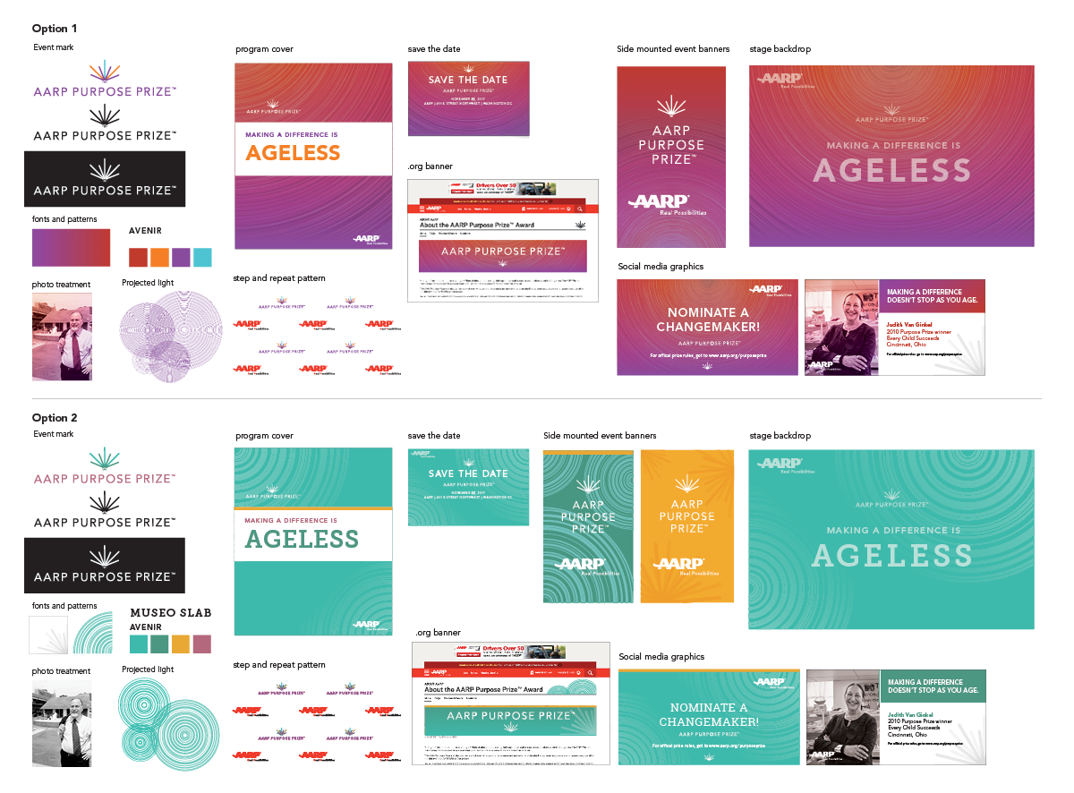
Early ideas for the look and feel
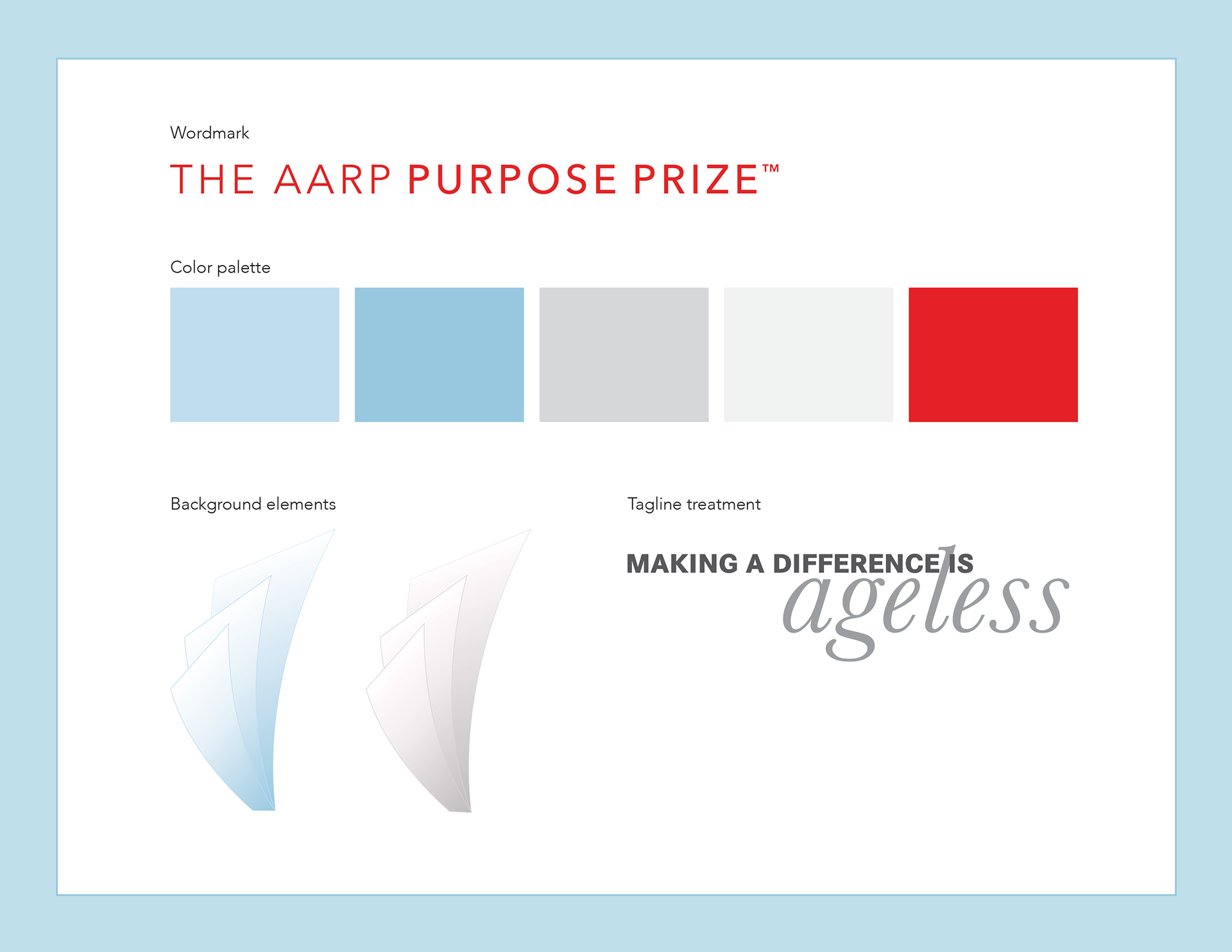
Our early concepts revolved around the theme of a “ripple effect” created by nominees. These ideas had a vibrant color palette and sense of motion. We determined after our initial review that this should take a calmer and more classic approach, as we realized bright colors wouldn’t match the tone of the event. Instead, we introduced an italic font and softer colors. The sense of motion was retained in background elements.
We looked to The Oscars, MacArthur Genius Grant, and the Kennedy Center Awards for inspiration. The sophisticated colors and polished feeling resonated with the team.
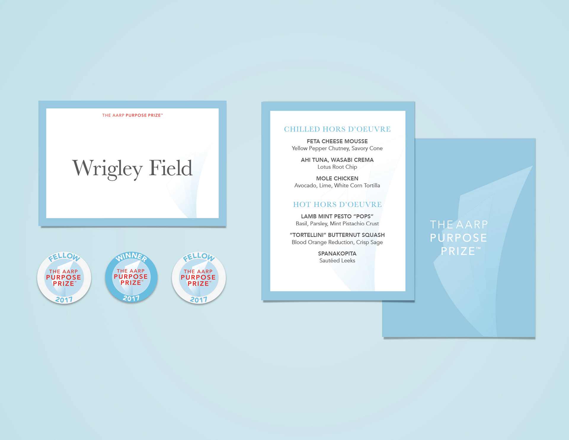
Table cards, menu, and buttons
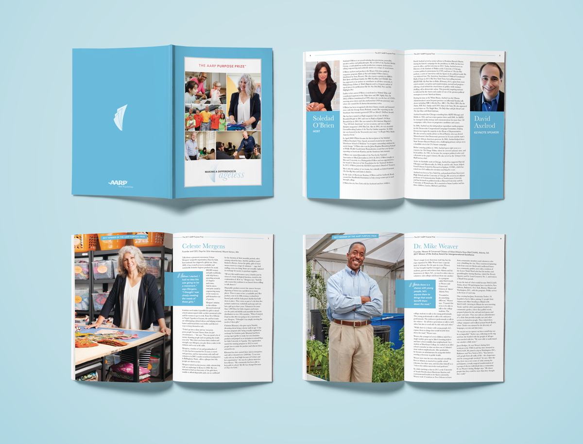
Program sample pages
Notable challenges included creating a distinct look and feel that resonates with our target audience while fitting in with the overall AARP brand.
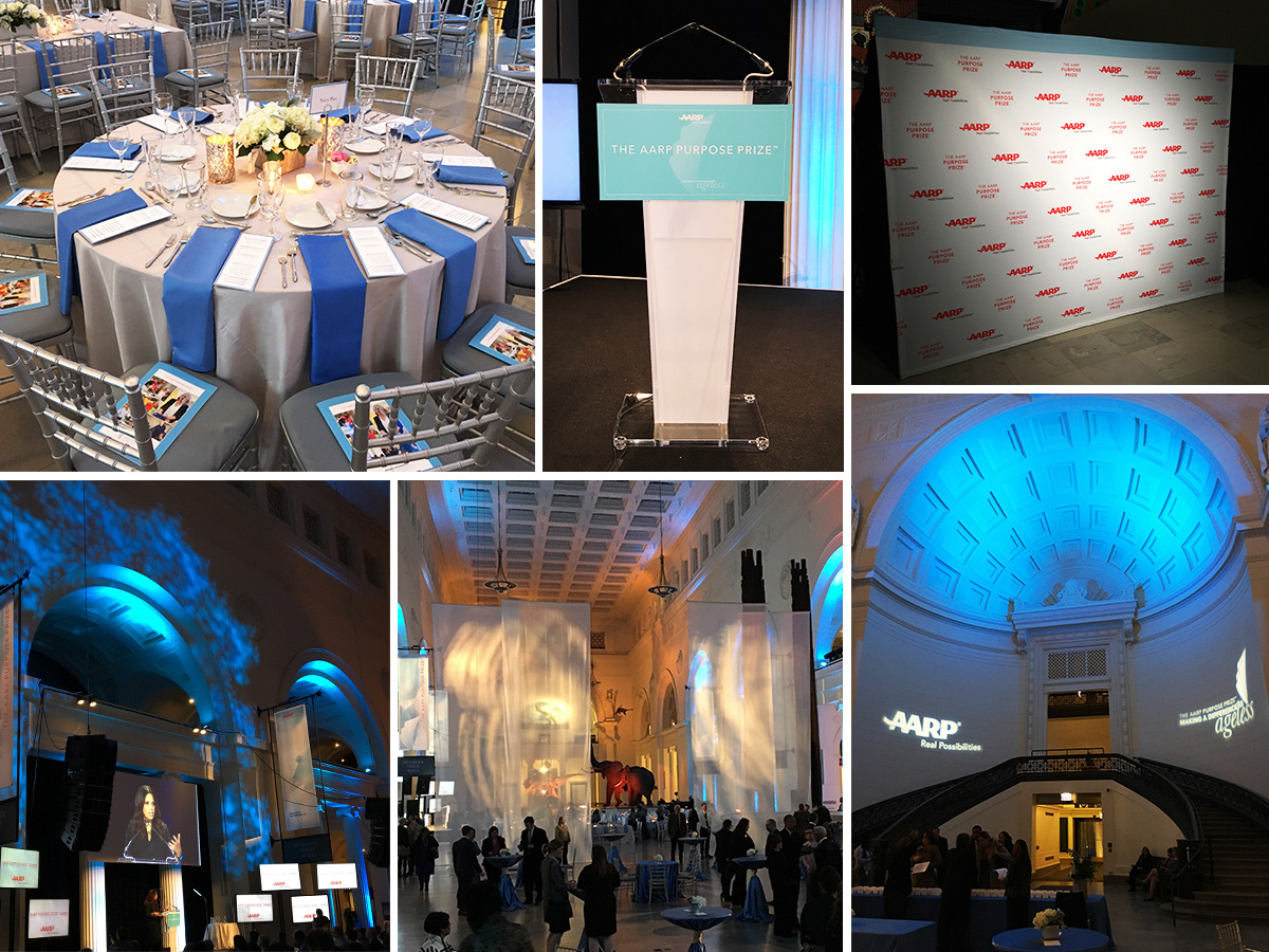
Event photos showing a podium sign, step and repeat, stage, and gobos
Overall, the clients were pleased that we established a look that elevated those who made a difference, as these changemakers may not have been previously recognized on a national level. The event was a success, and we plan to expand The AARP Purpose Prize award for the future.